
“The Secret Language of Colour: 10 Things to Know Before Choosing Art for Your Space”

Summer Meadow - Bright colours energise your space and inject positive colour into a neutral interior
Have you ever walked into a room and instantly felt calm, energised, or even a bit unsettled—without quite knowing why? More often than not, it’s the colours around you quietly working their magic. As an artist (and a bit of a colour enthusiast!), I know just how much colour can shape the mood of a space. So, before you pick that next painting for your home, let’s talk about how to harness the power of colour to create the atmosphere you truly want.
Here are my top 10 things to consider when choosing a painting for your room—trust the process, and let’s make your space sing!
1. Start with the Mood You Want to Create
Ask yourself: how do you want to feel in this room? Calm and restful? Energised and inspired? The colours in your artwork will set the emotional tone—so get clear on your intention before you start shopping.

Summer Confetti with it’s fresh greens, uplifting pinks and playful style would work well in a space where you want to bring the benefits of nature in
2. Understand Colour Psychology
Different colours evoke different feelings. Blues and greens are soothing (perfect for bedrooms or chill-out spaces), while reds and oranges are energising (great for kitchens or creative studios). Be mindful—no red in the bedroom unless you want restless nights!

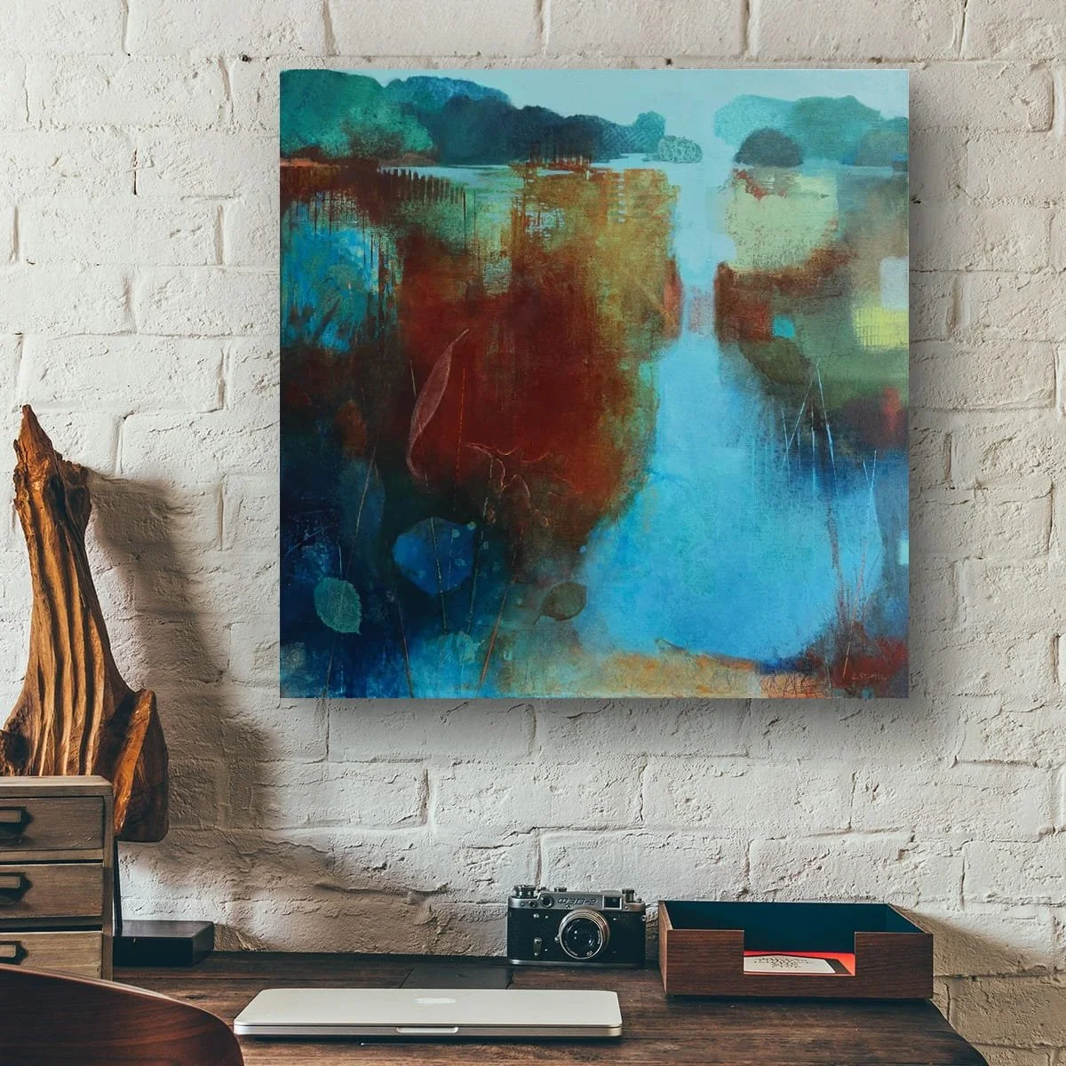
Here Comes The Rain Again is painted using energising turquoise and rich blues with accents of golden apricot. Perfect with pale wood or neutral tones
3. Consider the Room’s Natural Light
Natural light changes how colours appear. A painting that glows in a sunlit room might look dull in a dim hallway. Test your artwork in the actual space before committing, if you can.
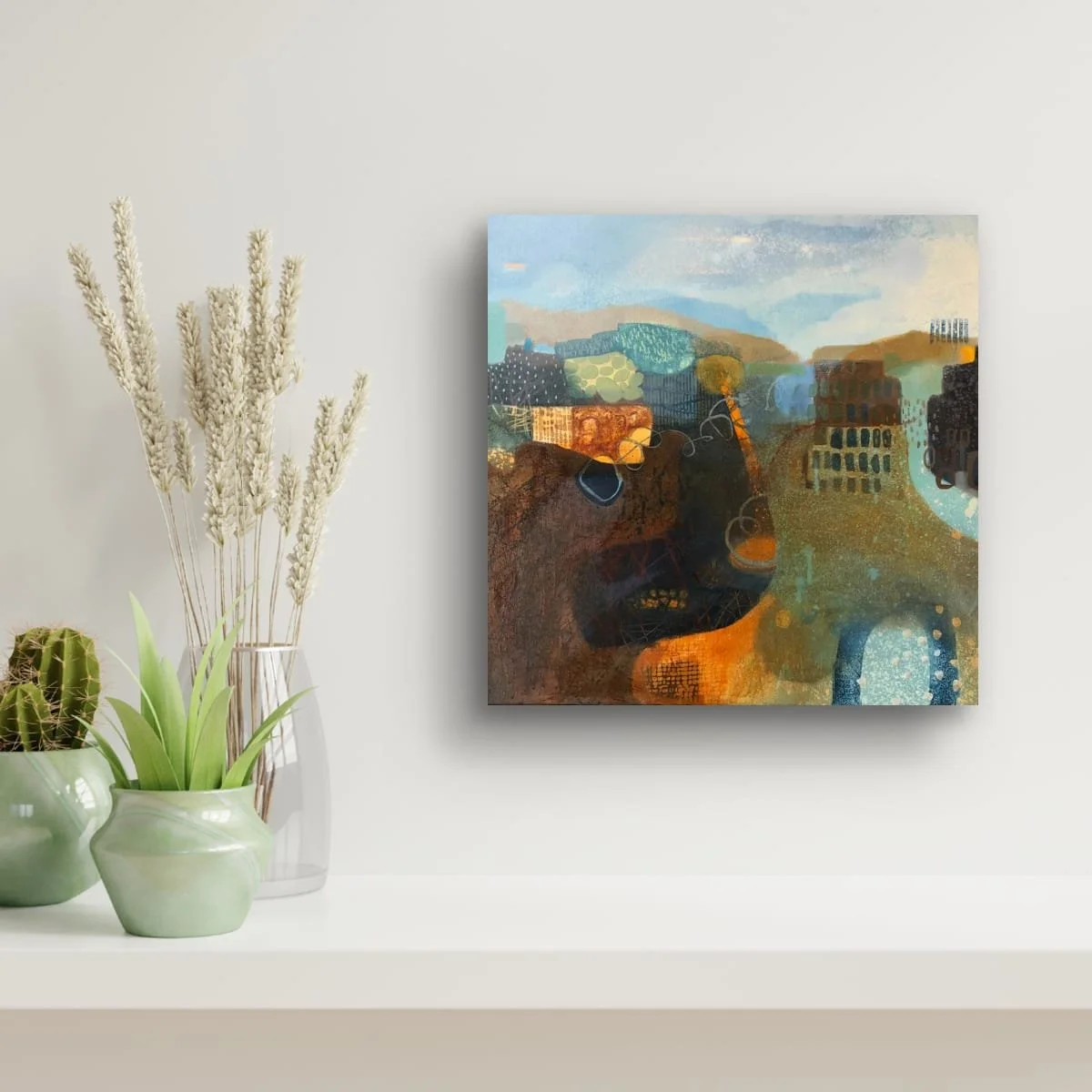
The Way We Were, painted in rich earthy tones with accents of duck egg blue - perfect for creating warmth in places with natural light
4. Balance Boldness and Subtlety
A vibrant, colourful painting can be a stunning focal point—but too much intensity can overwhelm. If your room is already full of colour, a more muted piece might bring harmony. If your space is neutral, a bold artwork can add that much-needed spark.
Favourite Autumn Sweater is a textured painting in muted earth tones that works well with pastel shades.
5. Think About Size and Scale
A large, colourful painting can dominate a small room, while a tiny piece might get lost on a big wall. Let the size of your space guide your choice—sometimes, less is more!
Red, Gold and Green is a small painting that would work well to enhance a curated corner. It is also available as a print in sizes that work well as a statement piece.
6. Match (or Contrast) with Existing Decor
You don’t have to match your sofa exactly, but consider how the colours in your painting will interact with your furniture, rugs, and accessories. Sometimes a contrasting colour can make both the art and the room pop!
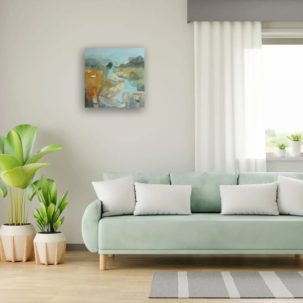
Halcyon Days has a predominantly blue and bright green palette but the yellow accents work well with the accent colours in this interior.
7. Layer with Texture and Technique
It’s not just about colour—texture matters too! Thick brushstrokes, layered media, or a glossy finish can add depth and interest, changing how the colours feel in your space.
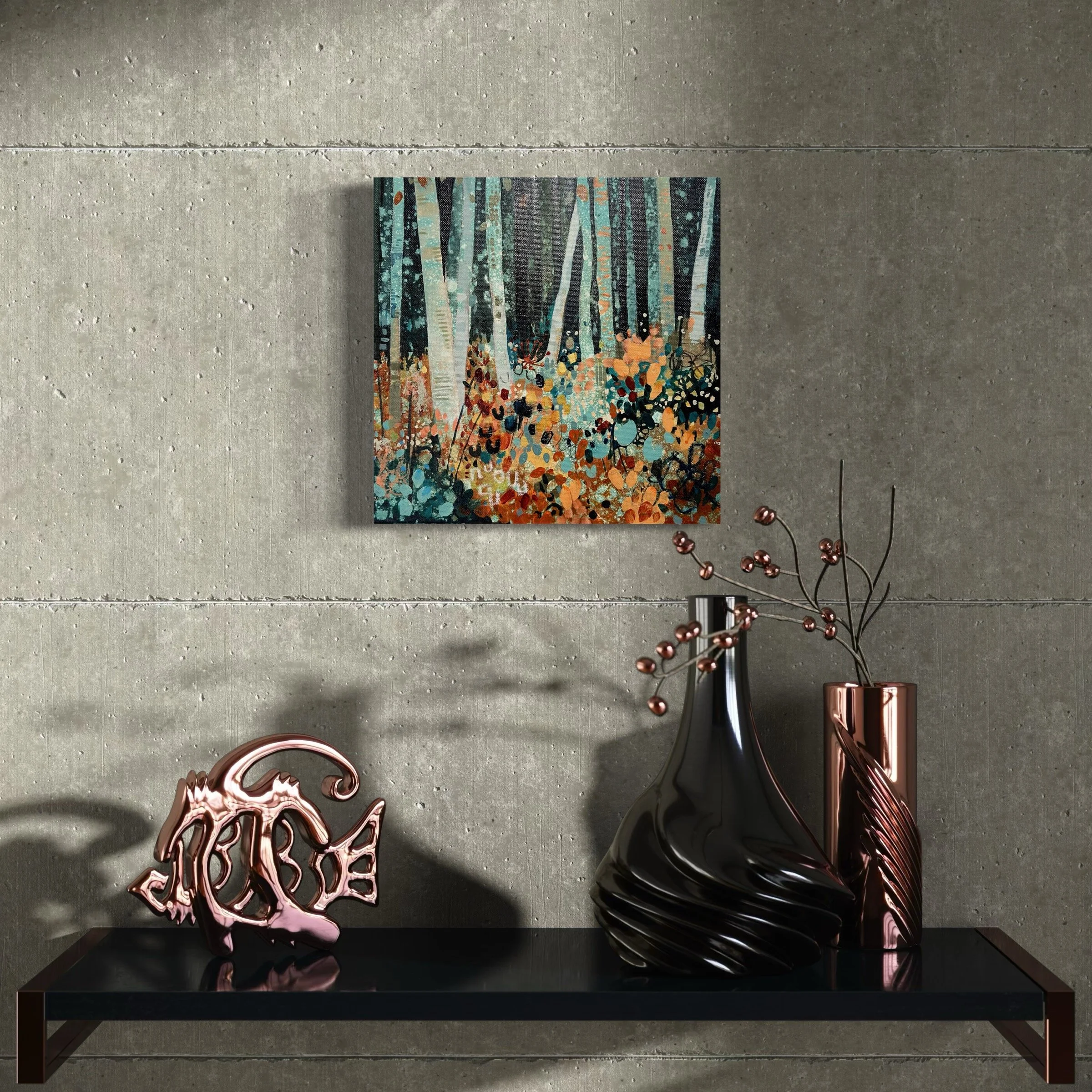
Earth Song is a multi layered textural painting using rich earth tones which work brilliantly with dark wood and a natural interior theme
8. Reflect Your Personality
Your home should feel like you. Choose art that resonates with your story, your travels, or your dreams. The colours you’re drawn to often say a lot about who you are—embrace that!

A Walk On The Wild Side is a painting with energetic brush strokes but uses neutral tones that work well in calm spaces
9. Don’t Forget the Power of Neutrals
Neutrals aren’t boring—they’re grounding. A painting with soft greys, creams, or earthy tones can create a peaceful backdrop, letting you add pops of colour elsewhere (hello, scatter cushions!).

Grouping paintings together creates focal harmony to a corner. These little abstracts give textural interest that compliments the smooth rich mahogany furniture. Patchwork Earth - quadriptych - also available as giclee canvas prints
10. Trust Your Gut (and Enjoy the Journey!)
At the end of the day, art is personal. If a painting makes you smile, calms your mind, or sparks your imagination, it’s the right choice for you—regardless of the “rules.” Life is all about the journey, so why not enjoy it?
Final Thoughts
Choosing art for your home isn’t just about filling a blank wall—it’s about creating a space that feels right for you. Let colour be your guide, and don’t be afraid to experiment. If you’re ever in doubt, remember: trust the process! And if you need a little help, you know where to find me. :)
Alison
x